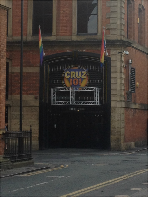
Just to keep your whistles whetted, I've sprinkled some pix from the weekend in this post. Just remember, patience is a virtiue, virtue is a grace... (five points if you can tell me the end of the saying).
I went to the Romantic Novelists Association (RNA) London chapter (can you see what they did there, I did smile when I found that out, and even now it makes me giggle a bit) and the very lovely JD Smith talked through the importance of a good book cover. Here’s a few pointers from her very informative talk.
Readers it seems, are a fickle lot, they do judge books by their covers. They look at a bad cover (something the writer may have knocked up on Powerpoint with a smart phone and a spare hour or so – some were truly awful I can tell you!) and they think, ‘bad cover, bad writing,’ and don’t buy the book. Just like that, they click on and don’t buy it. Harsh I know, but life’s like that sometimes.
There’s no reason why you can’t use the same cover for an e-book and a paper book, although some do chose to differentiate. (I don’t see why you’d double your work, but that’s just me)
With e-books it’s important to think about how the cover displays when it’s about an inch square, so often any small text isn’t viewable. Here readers are scanning for author names they’re familiar with, so they know what they’re getting, or a picture which clearly shows what they’re getting even if it’s from an author they don’t know. Chick lit, lots of flowers and hearts; crime thrillers, dark backgrounds; historicals, twirley typeface and someone in a bodice...you get my point.
- Good imagery - appropriate to the type of book is very important – using stock photos from a library is no problem, but they have to be the right stock photos. The right length of hair for the time period, the right clothes, etc. Caution was urged about the overuse of stock photos, and a number of authors showed their book covers all with the same guy on them. Ok, so he was pretty cute, I’m not going to lie, but on about six different covers, in slightly different poses, I don’t think so.
- Good colour choice – which links to the type face and imagery which fits with what the book’s about.
- Good typeface – appropriate to the genre of the book – swirley and a bit fancy for a period book, and blocky and impactful for a thriller
Do you know what it is? If you do, you’ve beaten me. It’s that square that looks like a barcode which has been distorted in the wash. You scan it with a smart phone with a special little thingummy and it can take you to the ‘buy me’ page for the book. Handy.
So that was the RNA, they have monthly meetings, which I’m going to try and attend, they’re a great friendly bunch, and also because of the novelty of not only being the only man in the room, but a real live gay one too! Which they were all very friendly and welcoming about.
Have you been put off by a book cover? Or have you bought a book which had an iffy book cover, but which turnred out to be a great read anyway? I'd love to know.
Until next time
Liam xx


 RSS Feed
